Understanding your reports
What each metric, breakdown, control, and drill-down in the Analytics dashboard means, and how date comparison and filtering work together.
The Analytics section shows one dashboard per connection. This page explains what every part of it means. For setup, see the quickstart. For page-level reports, see document analytics.
Dashboard controls
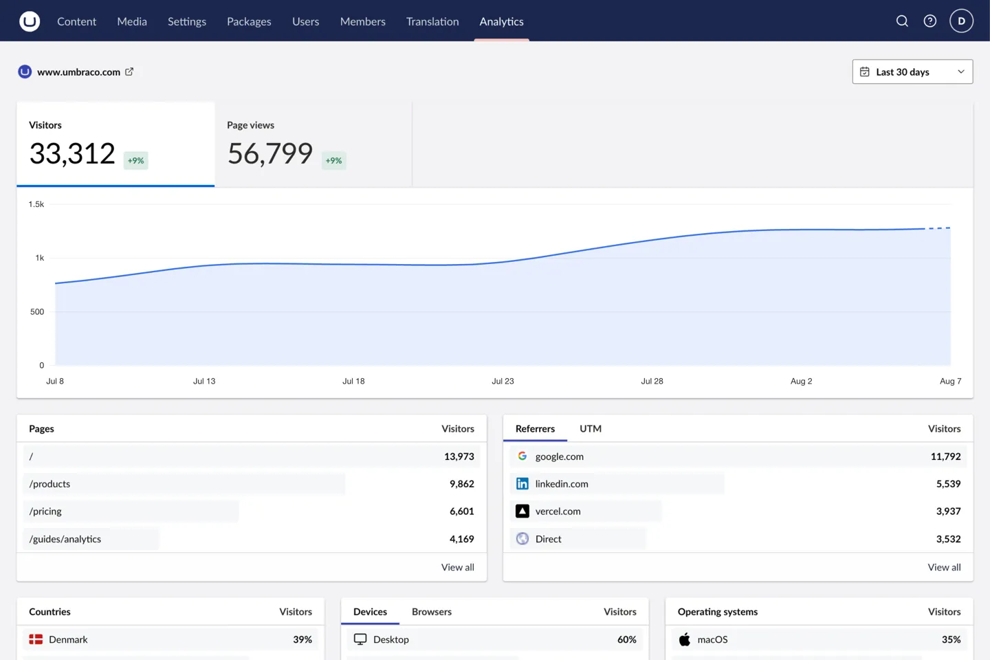
Two controls in the header shape every report below them.
| Control | What it does |
|---|---|
| Analytics connection | Switches between configured connections when more than one exists. Every metric, breakdown, and filter is scoped to the selected connection. |
| Date range | Pick a preset (Last 24 hours, Last 7 days, Last 30 days, Last 90 days, or Last 12 months) or set a custom range. The default is 30 days, changed with DefaultRangeDays. |
The range also decides how history is grouped. A single day is grouped hourly, up to a month daily, up to a quarter weekly, and anything longer monthly.
Metrics and history
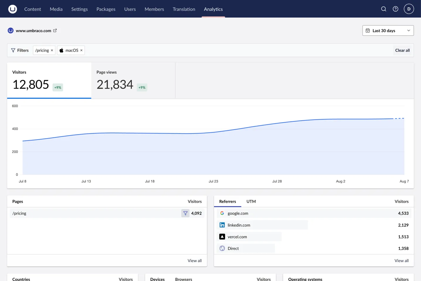
Two metrics sit at the top of the dashboard. Visitors counts the distinct people who arrived in the selected range. Page views counts the pages they loaded.
Each metric is always compared against the preceding period of the same length. There is no toggle for it. The badge shows a signed percentage such as +12%, and reads in full as “12% more visitors than the previous 30 days”. When the previous period has no data, the badge disappears instead of inventing a change.
Select a metric to plot it over time. The chart uses the interval implied by the range, and draws the final segment as in-progress while the current period is still running.
Breakdowns
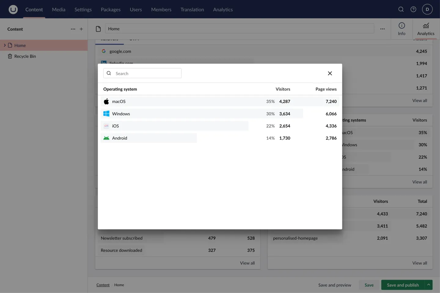
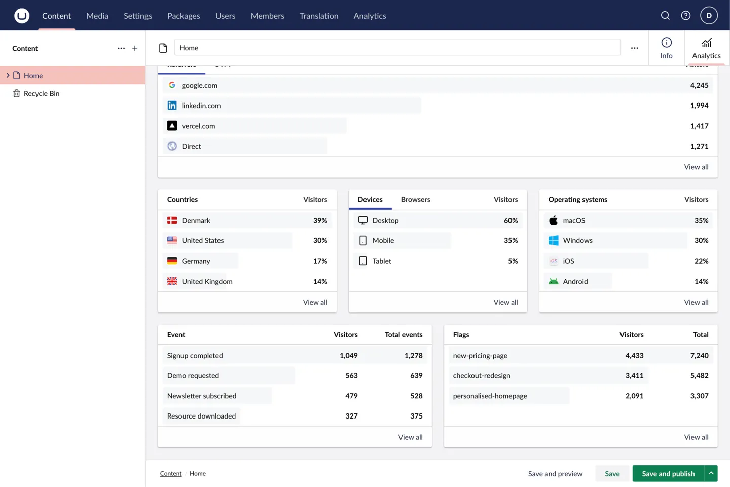
Breakdowns rank the pages, sources, places, and devices behind those totals. Each card lists the top entries with a proportional bar and the metric value. View all opens a searchable dialog with the complete list.
| Card | Shows |
|---|---|
| Pages | The most-visited request paths. (Hidden on a document report, which is already scoped to one page.) |
| Acquisition | Where traffic came from. A Referrers tab lists the sites and sources that sent visitors; when the connection supports UTM reporting, a UTM tab adds sub-tabs for Source, Medium, Campaign, Term, and Content from tagged marketing links. |
| Countries | Visitors grouped by country. |
| Audience | A tabbed card covering Devices and Browsers. |
| Operating systems | Visitors grouped by operating system. |
The UTM tab appears only when the selected connection can report those dimensions, which depends on the provider and its plan. On a plan-limited connection the card says so, rather than showing an empty tab.
Events
When the provider records custom events, the dashboard adds an Events panel listing each event and its total. View all events opens the full searchable list, and opening an event drills into its properties.
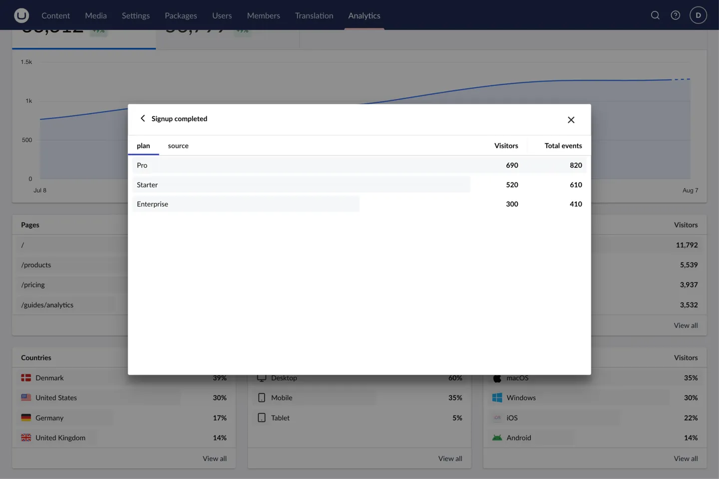
A property drill-down splits one event by a recorded property, for example which URLs an outbound-link event pointed at. On Plausible, name the properties you want to explore in the connection’s event-property settings. See the Plausible reference.
Feature flags
On a Vercel connection that reports feature flags, a Flags panel lists each flag with its totals, and View all flags opens the complete list. Plausible has no feature flags, so the panel does not appear on a Plausible connection.
Filtering and drill-downs
Any breakdown row can become a filter. Hover or keyboard-focus a row to reveal Filter by this value. Applying it narrows every report on the dashboard, for example to visitors from one country, or traffic from one referrer.
Active filters appear as a Filters group beneath the header. Remove one from its chip, or choose Clear all to go back to the unfiltered view. The URL carries the filters, the date range, and the selected breakdown tabs, so you can bookmark or share a filtered view.
Reports on a document
The same metrics, history, and breakdowns appear in the Analytics workspace on a mapped document, scoped to that document’s published route. The document view adds an Include child paths toggle, switching between the single page and the whole section beneath it. See document analytics for mapping and permissions.